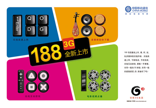
China Mobile officially launched the G3 brand
"G3" logo shape takes the meaning of Chinese Tai Chi, gradually rotating outward to the middle point, implying the constant change and wonderful extension of 3G life; Its core visual elements are derived from the most representative ink ink and vermilion seals in traditional Chinese culture, and are designed in a minimalist way with modern techniques. The logo also has rich color application and extension, which reflects that China Mobile actively supports national independent scientific and technological innovation, sets up a new communication platform, and provides customers with a wonderful and efficient digital information life.
G3 logo belongs to the bearer network logo, will not exist as a separate customer brand, but fully integrated into the three brands of China Mobile for promotion.
The strategic launch of the G3 logo means that China Mobile supports national independent scientific and technological innovation, sets up a new communication platform for customers, and leads a wonderful and efficient 3G life.
